ENTERPRISE PRODUCT DESIGN
graph visualisation tool
'Bloom', is a data visualisation product built from the ground up that would highlight patterns, show clusters and reveal connections in Neo4j graph databases. Bloom was designed to nest within the Neo4j Cloud platform that was being built in parallel.
Role: Design Lead
Responsibilities: Product management, conceptual modelling, facilitation, testing, research, team growth
The below focuses on product delivery and not on the details of design semantics in information visualisation or graph theory.
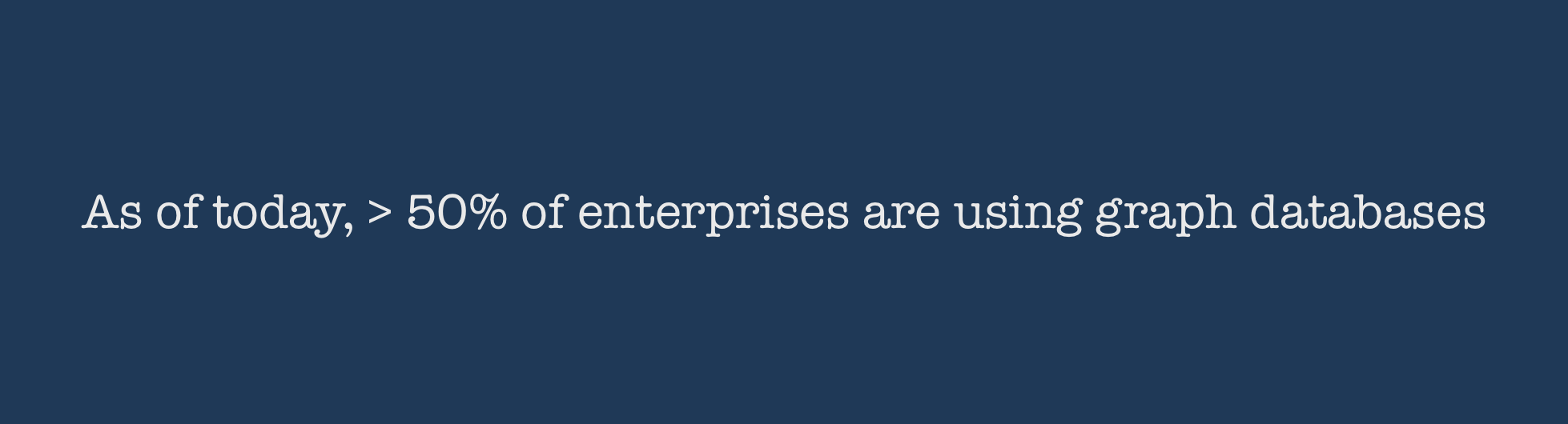
Source: Forrester Vendor Landscape, Graph databases, October 2017
HOW IT STARTED
Neo4j is a graph database company that powers some of the most essential enterprise use cases for connected data.
Graph visualisations are a powerful tool to convey the content of a graph in a given context. While there are many graph visualisation libraries, Neo4j wanted to:
Build its own business analytics tool using graph visualisation and leveraging its core database technology
Bring the power of graphs to non-developers without using the Cypher query language.
Give business users different perspectives on their data - reveal its connectedness, see the bigger picture, gain insights.
I was part of the product team from the outset.
The Neo4j database model supports use cases ranging from master data management to fraud detection.
THE CHALLENGES
A core challenge for me was moving forward with designs while collaborating with a distributed team across Europe, UK and the US. I had to bring together opinions of key stakeholders who each had diverging product visions.
What didn't work: The short sprints forced the design team to create, test, refine, and deliver their output unrealistically fast. As the project progressed, sign‐off milestones were driven by engineering estimates and time to create the right design was the time left over. The combination of a fixed launch date, lack of existing analytics and aggressive scope created many coordination and time challenges. Technologies used in development like vis.js, webGL had a huge impact on how design was developed and modified.
What worked: The team was iteratively delivering working software with design and development working in parallel. Design went lean testing ideas quickly. Both engineering and design recognised that we were not going to get it right the first time. The team was not hesitant to demonstrate work in progress - it was important that we see how something is working and how users were reacting to it.
HOW WE GOT THERE
A large part of the team was new to graphs.
Our lack of domain knowledge meant we needed to understand the nature of graphs and the Neo4j database thoroughly and quickly.
We also needed to acquaint ourselves with the existing product - the Neo4j Browser.
We approached all aspects of the project collaboratively. I used participatory design methods throughout the product development process to solve the challenge of working in a new + distributed team.
The product development process that evolved in the development of Insight.
STRATEGY and DISCOVERY
To better understand the problem and identify needs
I had multiple discussions with more than one audience. Primary user interviews with direct end users and secondary user interviews with internal employees from sales and field revealed real pain points in the current product and workflows.
To get familiar with the workings of the database
I partnered with a colleague to run Neo4j training classes. This gave me the opportunity to observe real users and examine the usability issues they have, the datasets they use and the context they want to view their data in.
To review market characteristics and trends
Conducted a competitive analysis with the tech lead Who are our direct and indirect competitors? What are their strategies? What technology do they use? What kind of visualisation and interaction experiences do they have? What are their relative strengths and weaknesses? How does our proposed offering compare?
To develop user empathy
I mapped my own customer journey aligning my actions, corresponding interface interactions and thoughts across the journey phases.
Customer journey
ANALYSIS and DESIGN
balancing product discovery with product delivery
I guided the design and analysis phase through running regular design sprints. The diverging - deciding - converging methods in a sprint were an effective method to make decisions quickly and collaboratively without group think.
I specified the primary design approach to be anticipatory design to reduce user fatigue in a highly technical product. As the product was starting out from scratch, there was an unique opportunity to embed these principles from the outset. In hindsight though, this may not have been the most feasible decision for a short term goal.
I facilitated the creation of personas, storyboards and mood boards. I also developed the frameworks for testing.
design Goals and CONSIDERATIONS
Collaboratively we consolidated the design goals and considerations for the product
Graphs in particular should show context, which means knowing the system to which your information belongs to, or the correlation between data to bring clarity to analysis and generate insights.
Data visualization is not merely graph aesthetics: it should also be about business strategy.
Displaying data in a comprehensible way such that decisions can really emerge out of data is challenging. This gets harder with "big data". In order to read and understand volumes of data, data types need to be matched with business objectives.
At the same time, you want to keep the data discovery experience generic enough for a user to integrate and mash up disparate data sources including real time data to create custom analytical views.
Managing data quality to ensure accurate decisions
Building a visualisation that can be accessed over various multiple platforms.
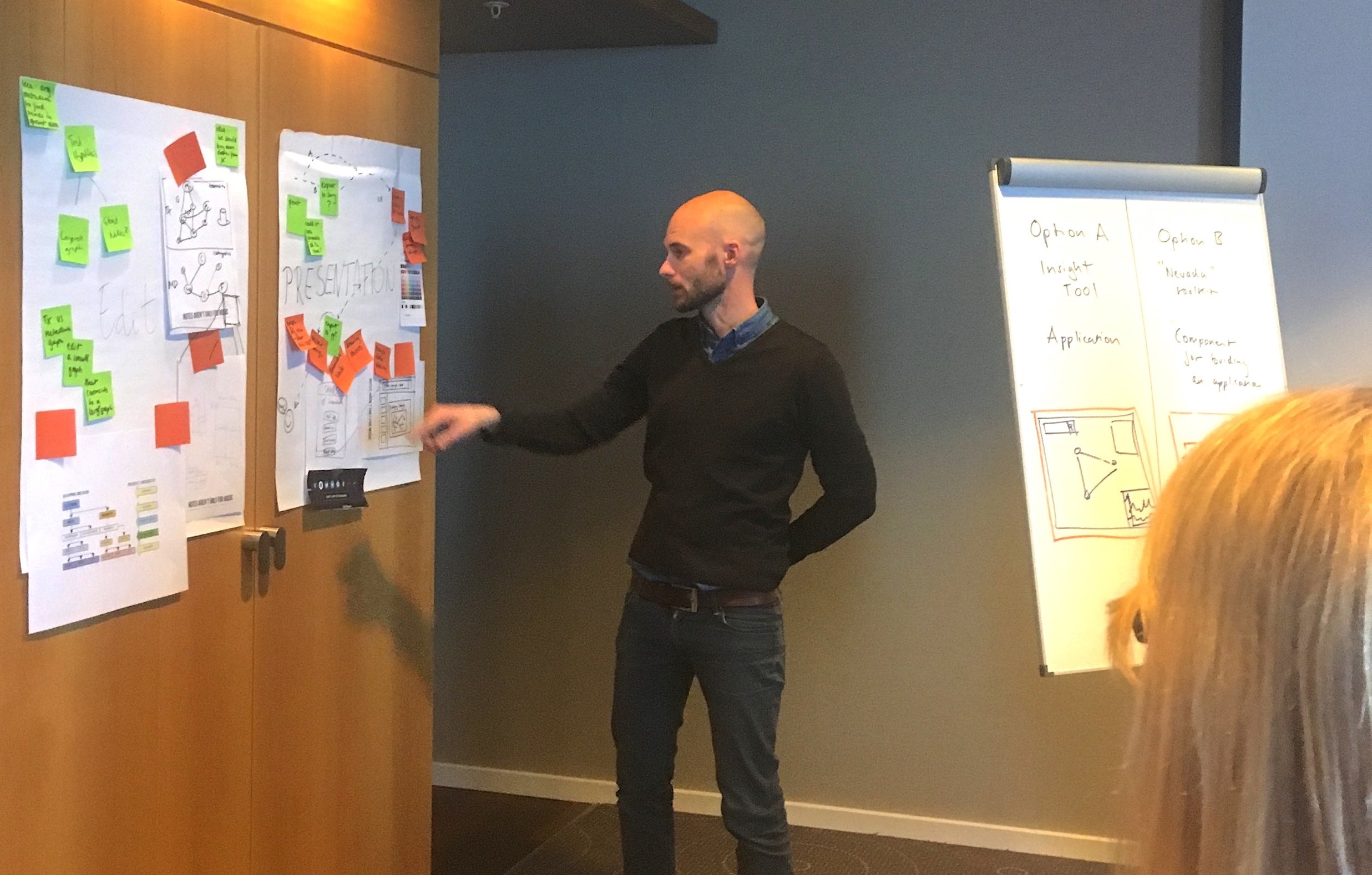
Speed critique: A developer narrating a group board while the team calls out 'stand out' ideas. As the facilitator I made notes of these ideas for the next step of 'narrowing down'.
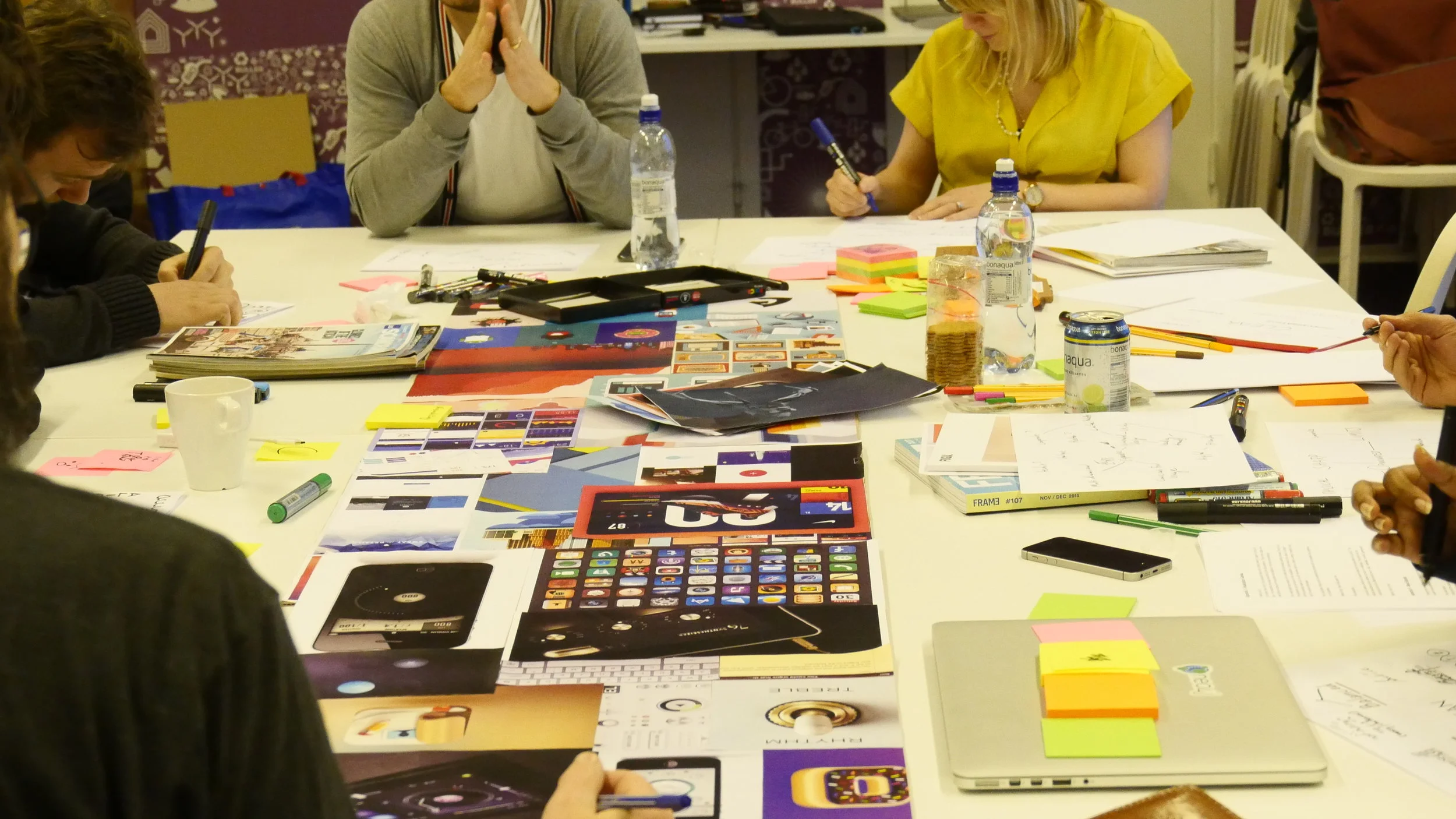
Visual mood boards helped translate ideas and concepts that can be difficult to explain only with words and create a common visual language within the team.
Product journey: Solutions defined in the sprint simplified into the product journey.
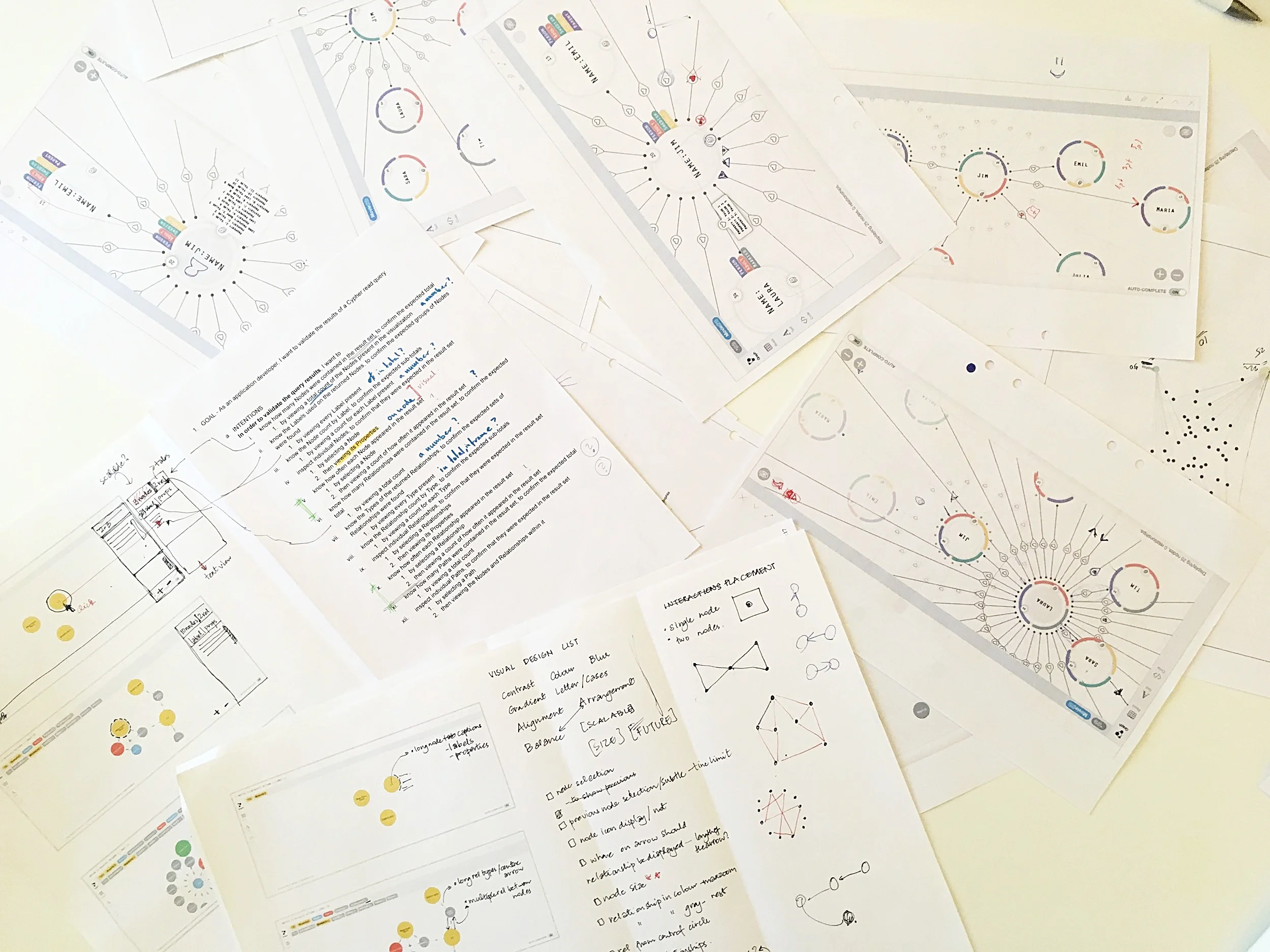
STORYBOARD PROTOTYPING
It’s tempting to jump straight into detailed design, but this often leaves open a lot of small unanswered questions. I used storyboard prototyping to answer these small questions and make a plan. This helped with demonstrating an end to end solution for a user scenario.
Filling out the story one grid frame at a time discussing each step. At the end of the day we had a couple of whiteboards full of built out frames ready to be put together. It looked messy to other who walked into the room, but to us it made complete sense :)
Decisions taken during storyboarding made it simpler to draft wireframes. We could now look at the bigger picture and see how multiple screens or pages connect together, and start considering the navigation between them. The more tangible aspects of usability and interaction would come next.
CIRCLES OR SQUARES
Visual information is processed 60.000 times faster than text, and most of what our brains absorb daily is visual information. Design research spanned from
Exploring shapes other than circles to represent 'nodes' in a graph to styling relationships to achieve a UML-ish model.
Types of graphs and graph colouring.
In line with the design approach of anticipatory design, I collaborated with the team to set up
Broad design principles: Clarity, efficiency, consistency, beauty, familiarity.
Generic data visualisation principles: providing visual cues, making it conversational, gradual reveal and maximising data-ink ratio.
Because graph theory originated from a map
I chose to inspect how users search and explore information on platforms like Maps. The entire premise of maps is using a massive graph with nodes and edges to figure out the fastest or shortest way to travel, look for paths via a start and end point, look for similar information, mark relevant results - a lot of use cases that analysts use to make better decisions.
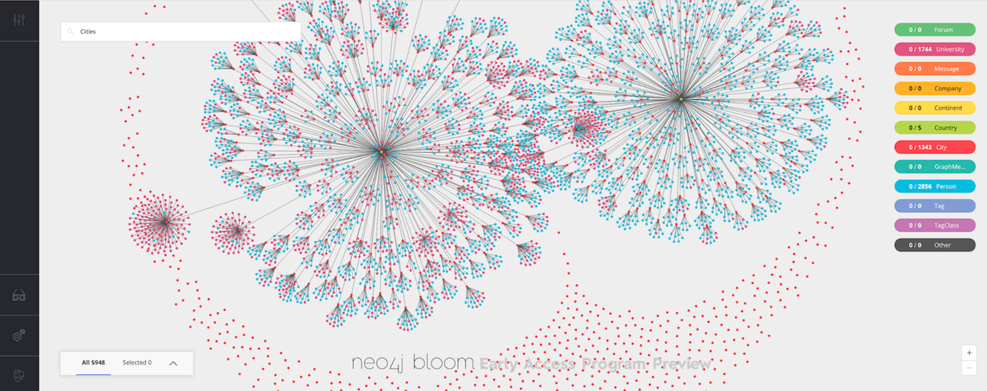
The gradual revelation of information on maps served as a good starting technique to explore 'zooming' in the graph environment.
Source: math.stackexchange.com, Apple Maps
graph interactions
Interactions in the graph environment needed to be designed to address cognitive, contextual and functional factors. It was crucial to consider usage of tactile interfaces and to give users just enough flexibility to reflect the subjective and qualitative aspects of their data. This kind of research required time.
Adapted from: Visual Complexity - Mapping Patterns of Information
GOING LEAN
Going lean, we grouped related functions together and baked them into a (context menu) UI familiar to all users. This approach helped test functionalities quickly, measure their utility and conclude which of those needed more comprehensive behavioral interactions. These learnings became part of the next sprint.
DEVELOPMENT and TESTING
Using a pair programming-designing approach we brought wireframes to life as a working prototype. Communicating requirements face-to-face and discussing constraints and possibilities was an effective way of solving the Interaction Design often with simple sketches.
We worked collaboratively, tested constantly and iterated progressively.
Paper mock ups for quick feedback.
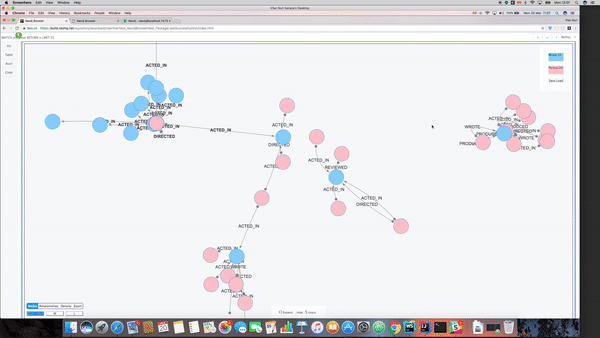
An early prototype translated from a sketch and used for user testing.
ONLY THE BEGINNING
Bloom was launched in October 2017 - 8 months from product kickoff. It got an enthusiastic response and is being iterated on. It is currently available in beta. Read more.
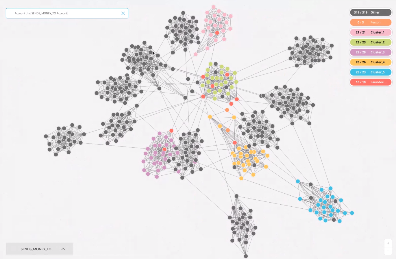
Visualising node clusters and connectedness in the Paradise Papers dataset.
A quick view that reveals a high level pattern in a given dataset.
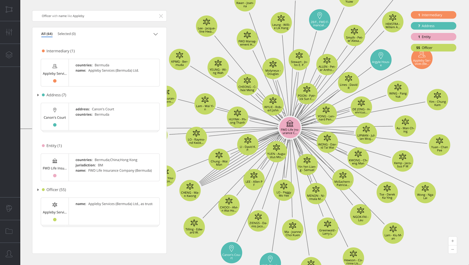
Exploring a cluster to reveal connections and view individual entities.
Product launch video. 31:45 - 48.05mins.