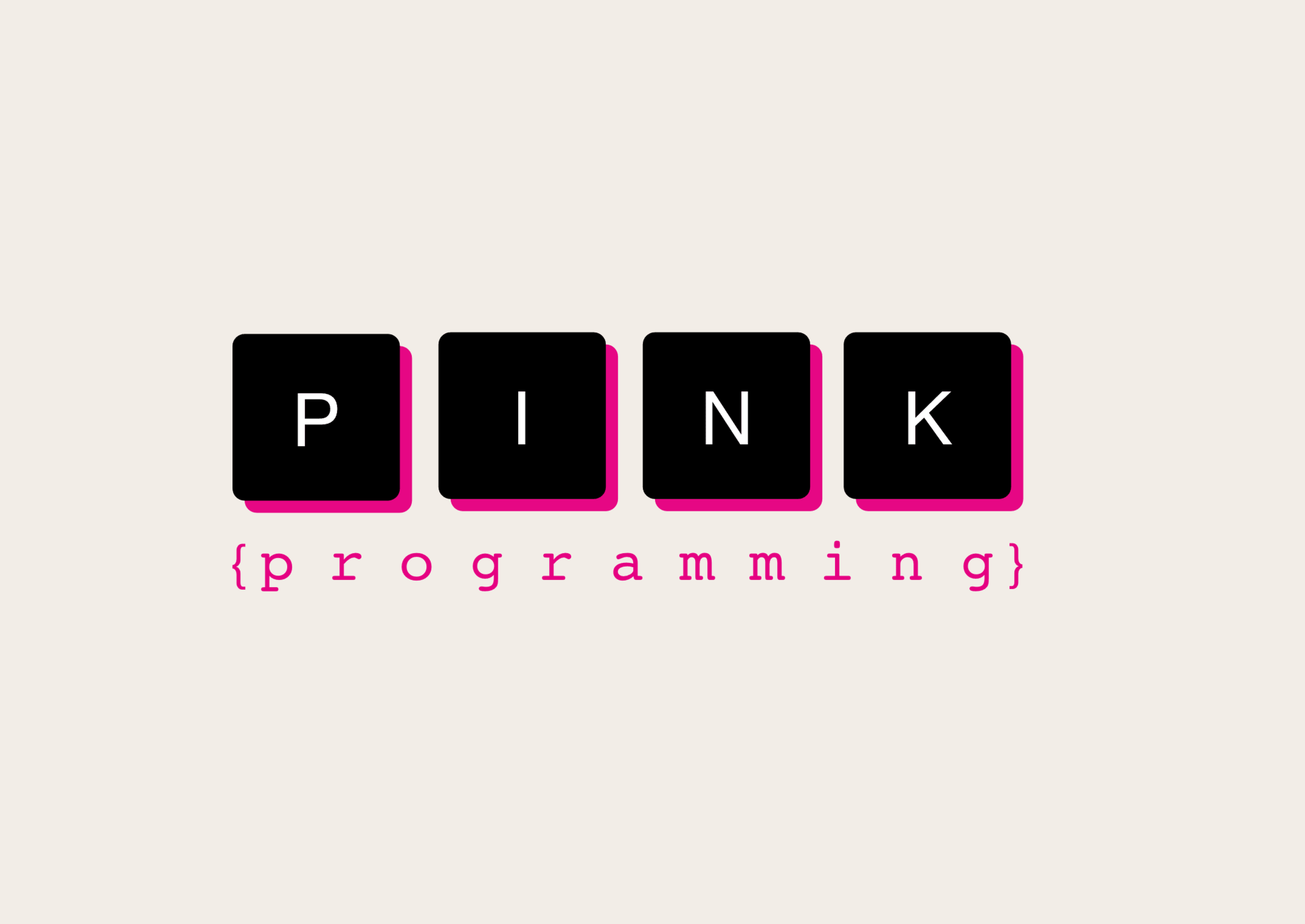
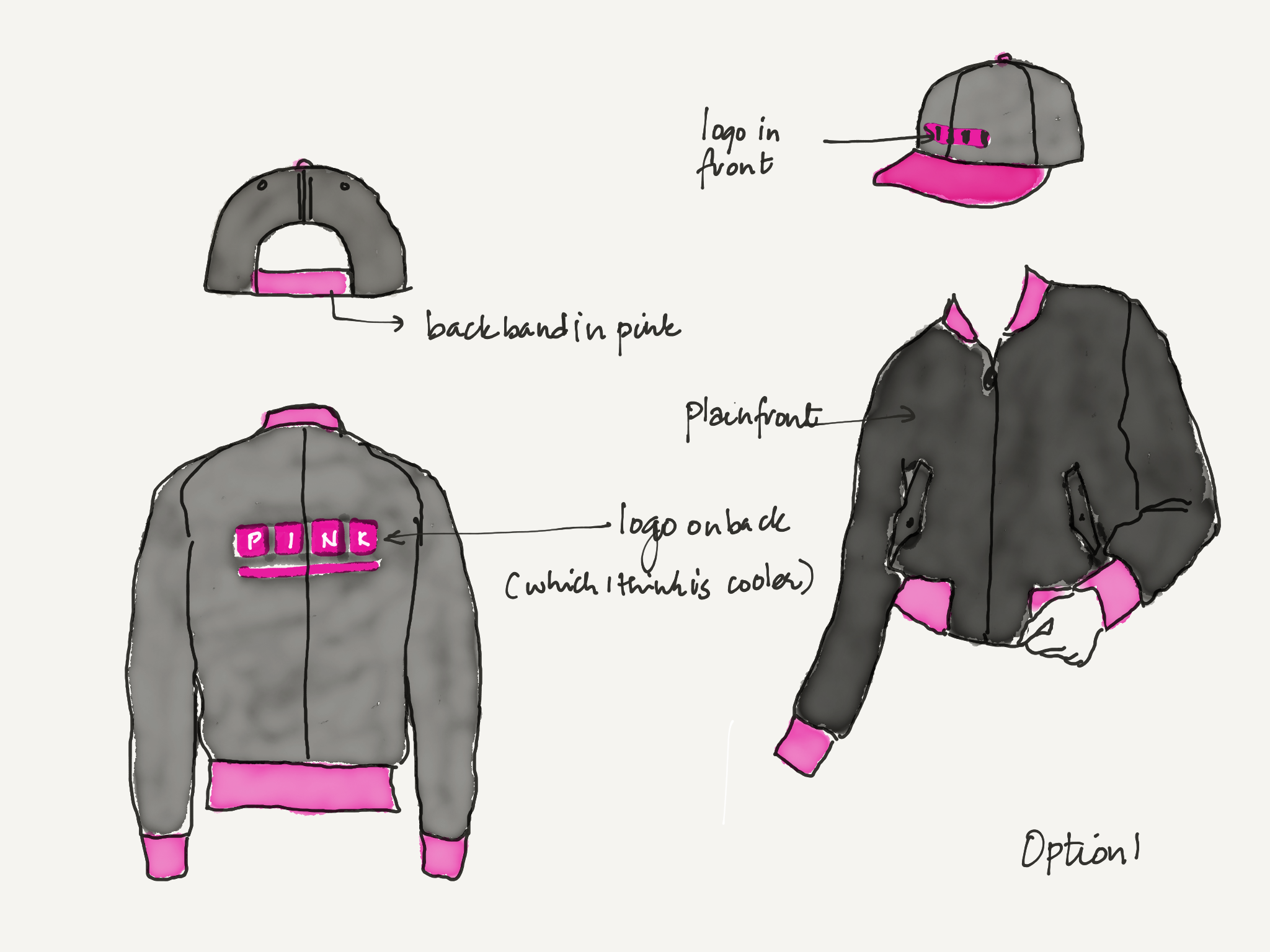
PINK PROGRAMMING | BRAND DESIGN
Pink Programming is a nonprofit with a mission to bring more women into technology. I joined as one of the first ten contributors and was responsible for building the brand from the ground up.
I leaned into the “Pink” personality to establish its visual identity - logo, color palette, and typography.
The end outcome was a bold inclusive brand close to the essentials of coding - keyboard keys with curly brackets and a monospaced typeface with a clean, iconic visual language. It was flexible enough to work across everything from digital to physical.
Today, Pink Programming continues to grow with 100+ active volunteers, 30,000 community members and 20+ partners. The organization still uses the original logo and brand foundations.
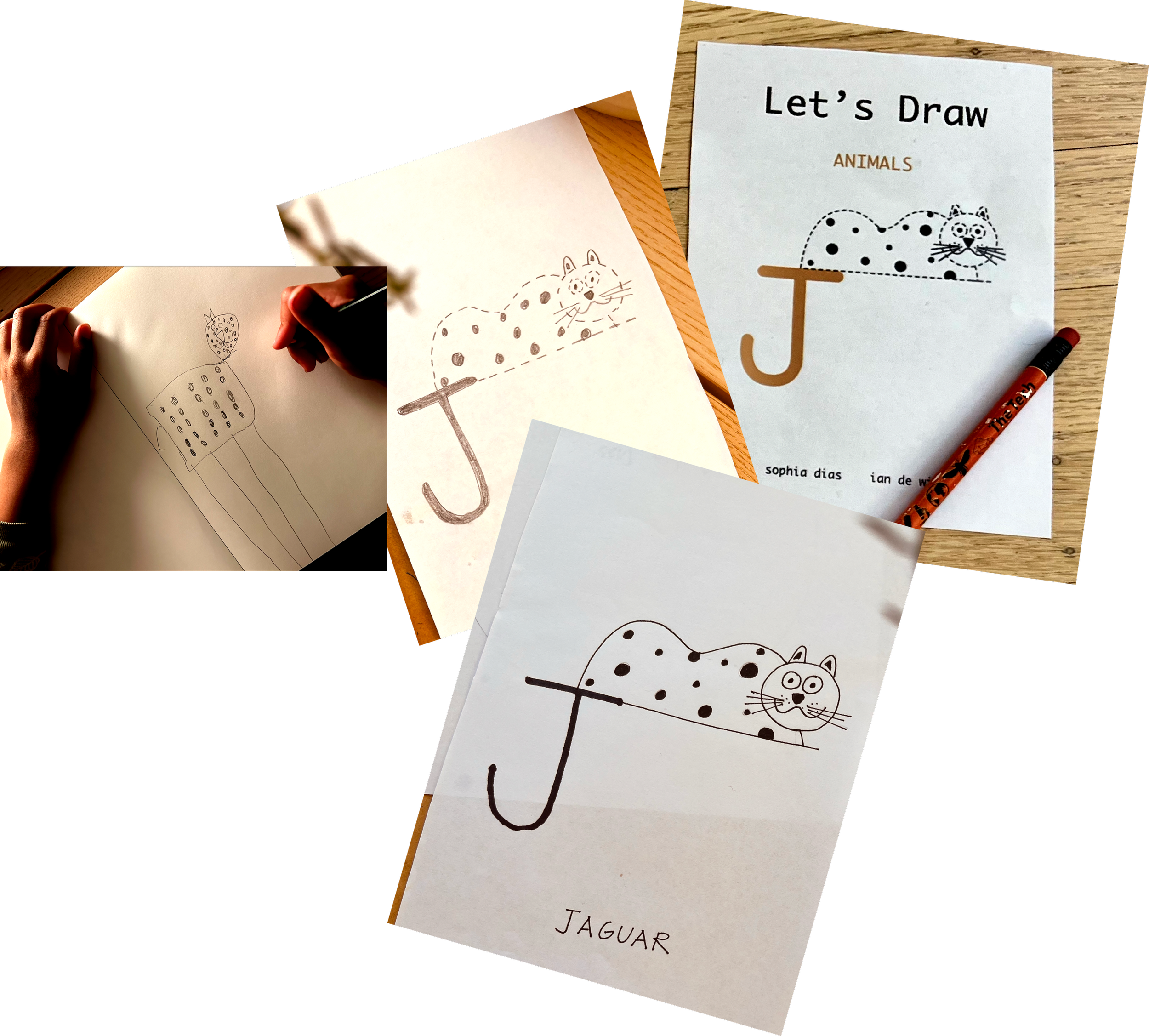
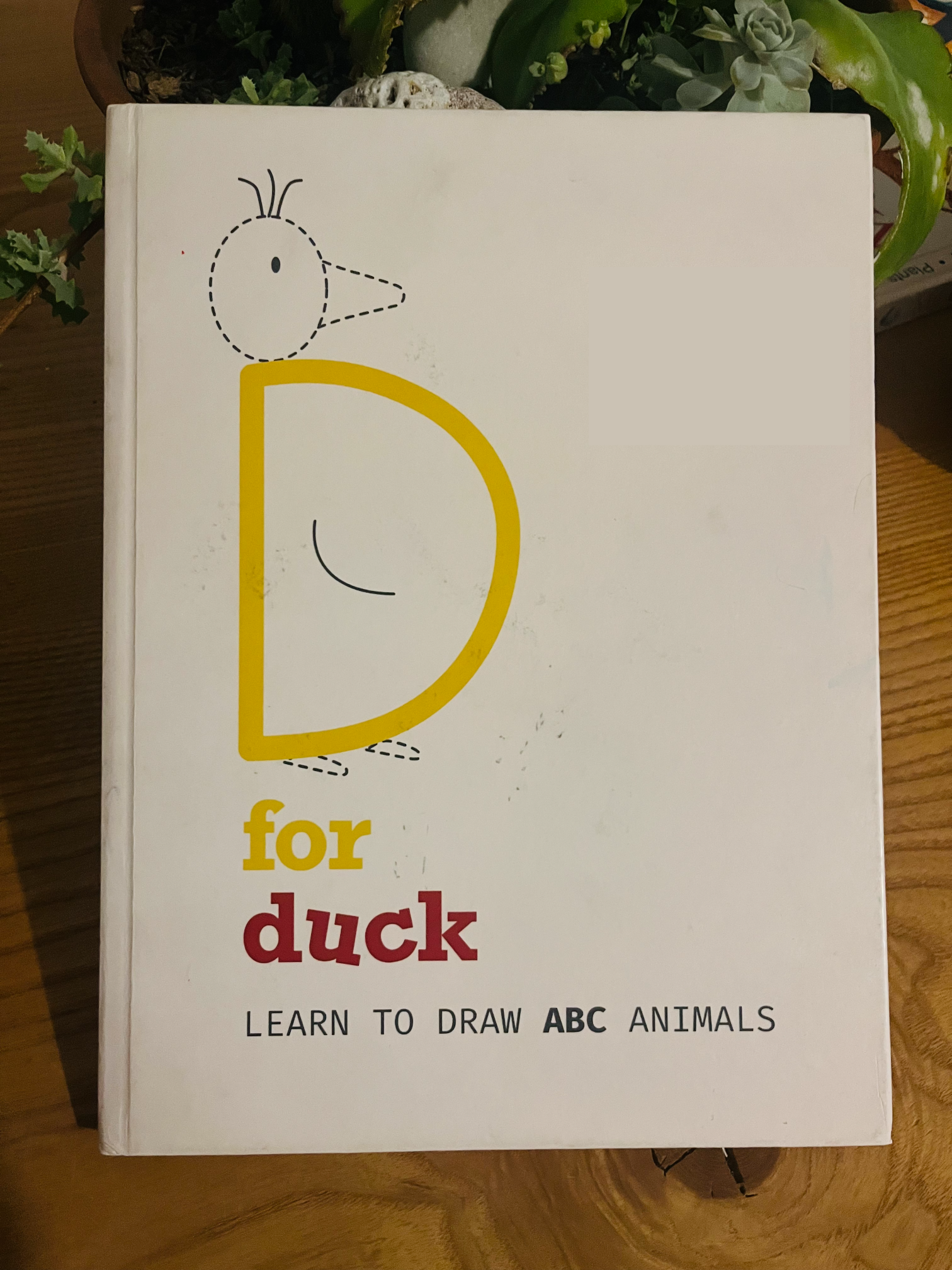
D FOR DUCK | BRAND & PRODUCT DESIGN
This book began as a creative adventure between me and my then five-year-old. When he decided he wanted to draw an animal for every letter of the alphabet, we had no idea how much fun it would be, how much we would learn along the way, and that we’d end up creating something to share with other families. Have you ever tried to think of an animal that begins with the letter X? We certainly hadn’t!
I took his original sketches, recreated them as pencil drawings, refined them in ink, and then carefully converted them into digital illustrations ready for print. I designed the brand identity and the “feel” - logos, colors, fonts and the name of the book.
This book is a celebration of curiosity and creativity, that happens when you follow a child’s idea :) While we never set out to create a book for sale, this project grew into something we wanted to share. Now available on Amazon.
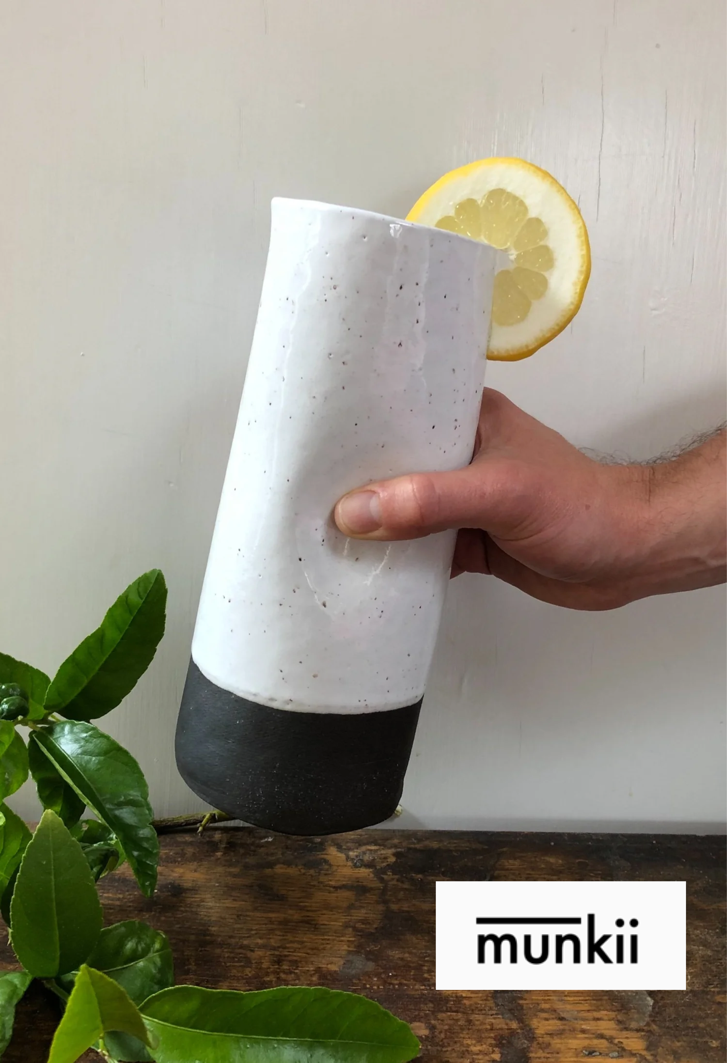
MUNKII | BRAND & PRODUCT
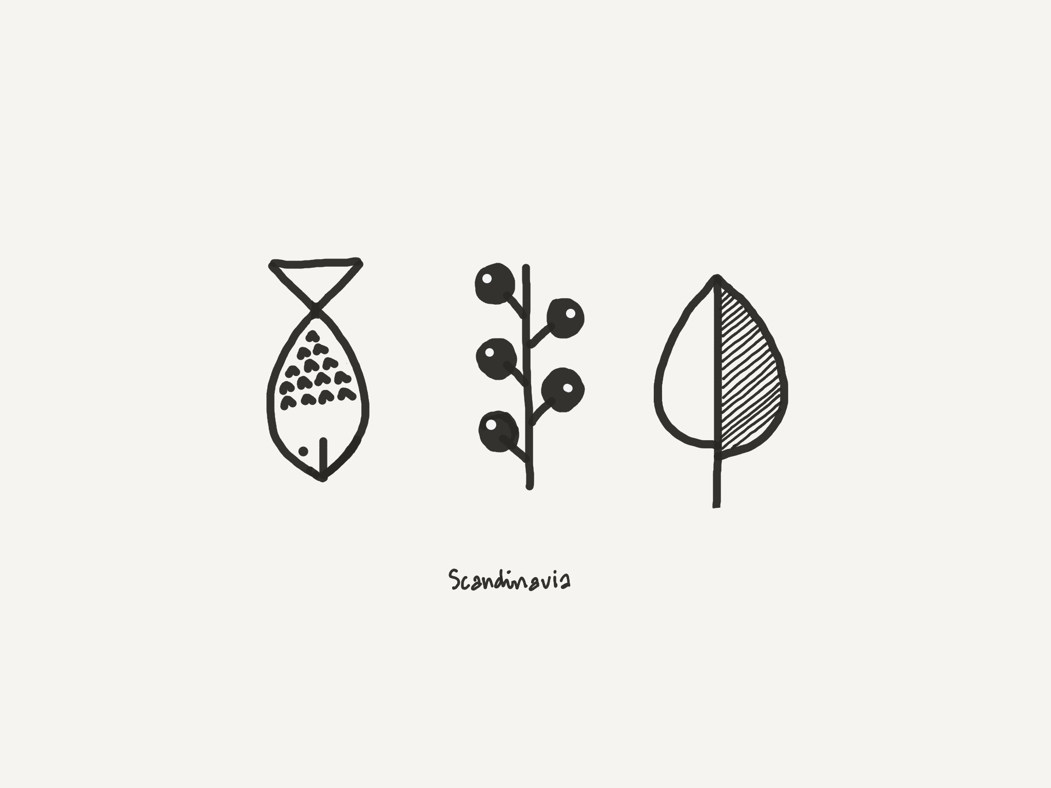
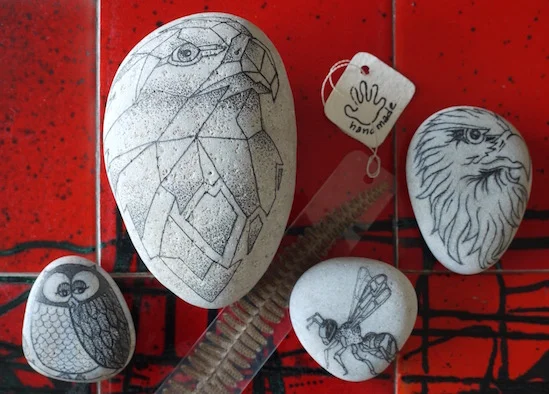
Working with my hands is a therapeutic antidote to life spent designing software products. MUNKII was born as a multimedia creative based in experiments of play and chance. A home for the things I make offline - digital illustrations, ceramics, and abstract sketches - created slowly and imperfectly.
The name Munkii comes from my travels in Finland, where my favorite treat was munkki - a Finnish doughnut. A small indulgence, simple and joyful. I built the brand identity to be both playful and simple - just like the work curated for it. The double “i” adds a whimsical twist. The horizontal bar draws inspiration from Indian handwritten scripts, where a continuous line connects letters - a nod to connection, craft, and my own cultural roots.
MUNKII is about slowing down, making with your hands, and leaving room for a little sweetness.